The challenge
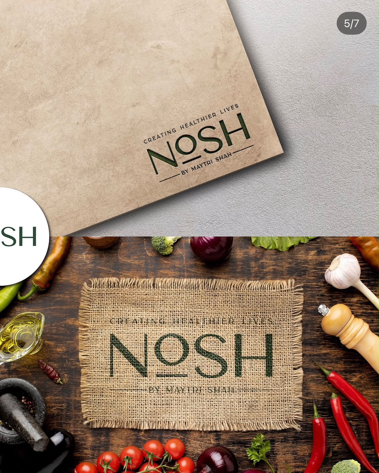
Nosh needed an identity that could carry a growing range without looking like every other health-food label on the shelf.
Our approach
We built the positioning first, then the mark, type and colour system around it — designed to hold up across packaging, social and print.
The outcome
Replace this with the real outcome: what changed for the business after launch.