Domino’s Serves a Fresh New Look
After more than a decade, Domino’s — one of the world’s most recognizable pizza brands — has unveiled a complete brand refresh.
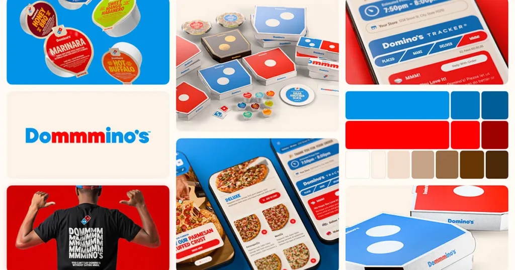
The update includes a revamped logo, energized color palette, modernized typography, and even a new jingle voiced by country artist Shaboozey.
For a brand that’s been synonymous with fast, satisfying pizza delivery for over 60 years, this rebrand shows how even the most iconic names can evolve without losing their flavor.
At The White Crab, we believe this refresh is a textbook case of how strategic design and sensory branding can breathe new life into a global legacy.
The Design Shift: Familiar Yet Fresh
Domino’s stayed true to its heritage — the signature red and blue domino tile remains — but everything feels crisper, more digital-friendly, and emotionally engaging.
What’s Changed:
-
Brighter, bolder colors designed for mobile and digital-first branding
-
A custom, rounded font called Domino’s Sans that visually mirrors the softness of pizza dough
-
Cleaner geometry, more whitespace, and refined balance between the tile and wordmark
-
The subtle “mmm” emphasis — turning “Domino’s” into “Dommmino’s” across campaign copy to capture the feeling of craving
This update isn’t about change for the sake of it — it’s about aligning visual identity with emotional appetite.
Branding Beyond the Visual
Domino’s didn’t stop at a logo redesign. The refresh extends across sound, packaging, uniforms, and digital experiences, signaling a full sensory strategy.
Sound Branding
The brand introduces a new audio logo — or as they call it, a “Cravemark” — an “mmm” motif sung by Shaboozey, turning sound into a brand trigger.
Packaging Evolution
Their boxes are now more vibrant — with bolder hues of red and blue, plus premium black-and-gold packaging for high-end pizza lines.
Experience Overhaul
Uniforms, delivery scooters, app visuals, and store interiors are being updated to reflect the new energy — one cohesive look, many touchpoints.
Why It Works: Lessons in Modern Branding
At The White Crab, we often remind clients that branding is not about a logo — it’s about consistency, emotion, and storytelling.
Domino’s new look demonstrates four key principles every brand can learn from:
-
Evolve, don’t erase. They built on recognition instead of starting over.
-
Design for emotion. The “mmm” idea connects design with desire — simple, sensory, memorable.
-
Go multi-sensory. Integrating sound and packaging creates a 360° experience.
-
Stay data-aware. The refresh was tested with real consumers for appeal and vibrancy before launch.
Our Take at The White Crab
Domino’s rebrand is a masterclass in timeless modernization. It proves that brands don’t need to reinvent the wheel — just give it a new spin.
For businesses looking to refresh their own identity, the lesson is clear:
1. Keep your essence.
2. Amplify what people already love.
3. Make every sense — sight, sound, touch — part of your brand story.
That’s how you stay relevant without losing authenticity.
Final Bite
Domino’s has successfully served up a rebrand that’s as satisfying as its pizza — simple, bold, and crave-worthy.
It’s a reminder that great branding isn’t about chasing trends — it’s about staying hungry for connection.
At The White Crab, we help brands craft exactly that kind of lasting impression — where creativity meets strategy and design speaks emotion.
Interested in rebranding your business?
Let’s craft a story as unforgettable as your brand.
Contact The White Crab for strategic branding and design that delivers results.


